Preview of Firefox 4.0
The pace at which Mozilla works can seem insane. It was less than a month ago when the the company released Firefox 3.5. Only three weeks later, Firefox posted screenshots of Firefox 3.7, which includes a change to the Tools bar and an Embracing Glass design.
But the ambition doesn’t end there. The Firefox team is looking even farther in the future: all the way to Firefox 4.0.
They’ve posted mockups of the new Firefox 4.0 design (included below) on their wiki. Firefox warns that they are just for brainstorming, but they provide the world’s first real glimpse into the next edition of the Firefox browser.
The Firefox Screenshots: Tabs on Top or Bottom?
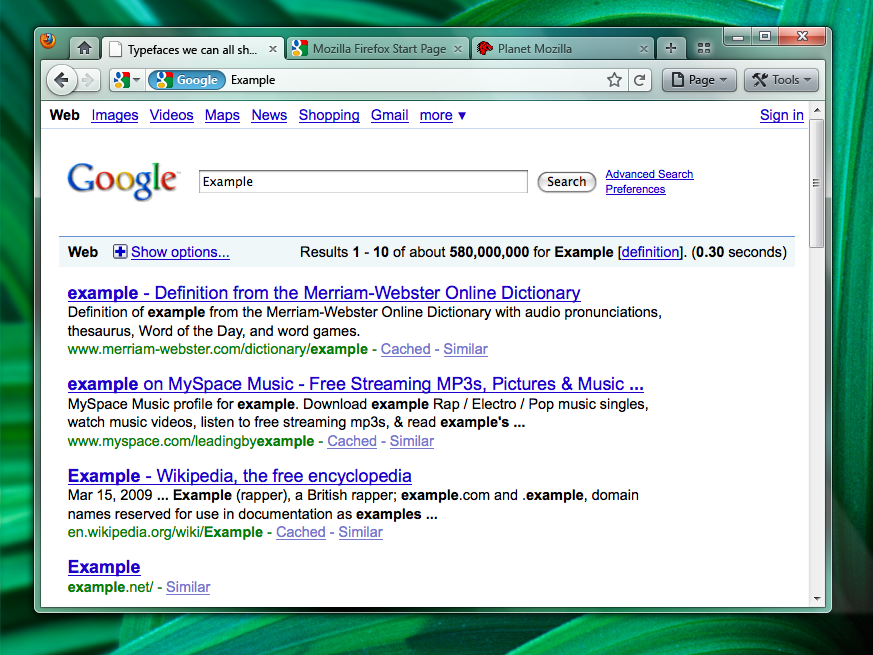
These images, all of Firefox in the Windows OS, reveal that the company is struggling to choose between two primary designs: tabs-on-bottom and tabs-on-top. Tabs on bottom is the current norm in Firefox, while the tabs-on-top looks almost exactly like the Google ChromeGoogle Chrome browser. Here is the tabs-on-bottom version (click for full-sized versions):
And here’s the tabs-on-top design:
In addition, Mozilla summarizes the pros and cons of the two designs very succinctly:
Positives:
– Save Vertical Space
– Efficiency/Remove Visual Complexity — Right now the tabs have to be connected to something. So we are adding an extra visual element for them to connect to.
– Shorter Mouse Distance to Page ControlsNegatives:
– Breaks Consistency/Familiarity — Moving things confuses existing users.
– Title is MIA — With the space removed from the titlebar you only get the truncated version in the tab.
– Longer Mouse Distance to Tabs — Takes longer to mouse to a tab.
– Lost Space — Sandwiched in between the application icon and the window widgets you lose some space.
While we won’t go into detail on the debate, we will say this: if Mozilla can offer the ability to choose between the two designs, it should. Some users need to get to the menu items faster, while others prefer having the tabs in closer proximity.
New Firefox 4.0 Feature: Combo Stop/Refresh/Go Button
Firefox 4.0 incorporates all of the design changes featured in Firefox 3.7 and includes a few new features. The big one is a Combo Stop/Refresh/Go Button.
Instead of separate buttons for each of these functions, they’re all integrated into one button on the right hand side of the address bar. It also changes colors based on your actions. So if you’re typing, it will be a green “Go” button, but if the page is currently loading, a red “Stop” button will take its place. Not a bad way to save space, if we do say so ourselves. Here’s a screenshot of the new feature in action:
Remember, this is all proposed, and feedback from the Firefox community shapes the browser into its final form. And you bet it’s going to get more great features, as it’s going to be some time until we can browse the web with this thing. But be sure to check out our sneak peek of Firefox in 2010 if you want to learn more.
LET US KNOW WHAT YOU THINK IN THE COMMENTS BELOW
Thanks Mashable
